Quick verdict: Buy the monitor that matches your color risk: EIZO for critical color, BenQ for Mac-friendly studio work, ASUS for value creator specs, and Dell for productivity-first design desks.
A better monitor will not make weak design stronger, but it can reduce avoidable mistakes. Color-sensitive designers need to know whether a layout, image, or brand palette is drifting before the client sees it. This guide compares creative displays by workflow fit rather than raw specification bragging: wide gamut, calibration, USB-C, panel type, support, and how much color risk your work actually carries.
This is an editorial desk review based on public product pages, support documentation, pricing or license pages where available, and design-production workflow analysis. It does not claim private lab access, undisclosed vendor briefings, or direct hands-on review unless a page says so. Readers can review About Design Overflow and our editorial policy before relying on any recommendation.
Commercial link: Check current BenQ PD3225U details. Design Overflow may earn a commission if a partner credits this link, but the recommendation above is based on fit, license clarity, support risk, and source evidence.
Quick Verdict Matrix
| Option | Best fit | Main strength | Watch before buying |
|---|---|---|---|
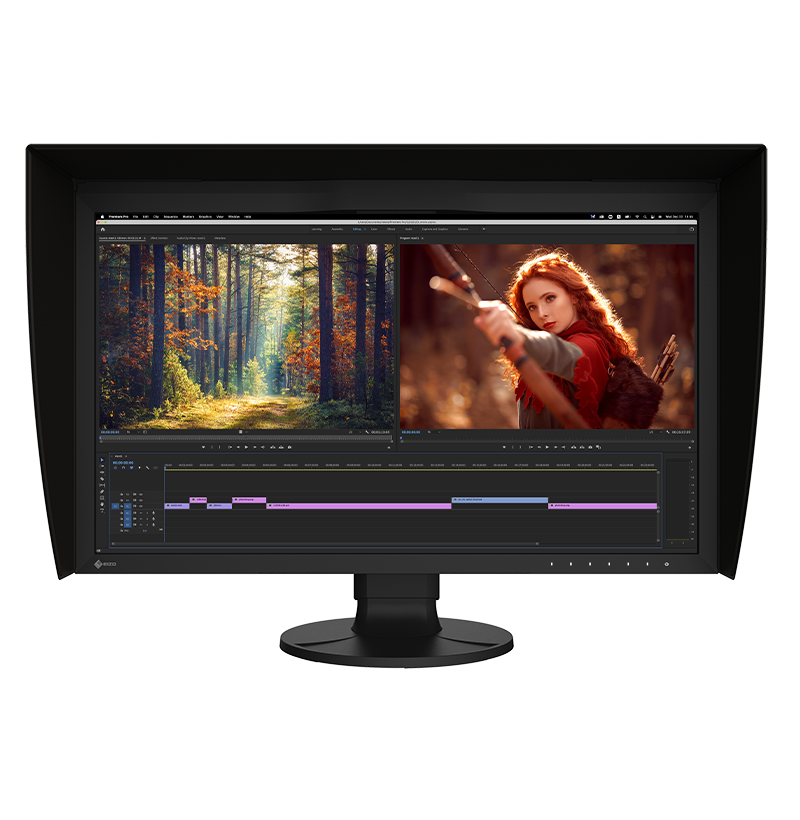
| EIZO ColorEdge CG2700X | Critical color, photography, print, and demanding review | Built-in calibration class positioning, 4K UHD, HDR targets, and high-brightness creative workflow | Premium price and overkill for general UI work |
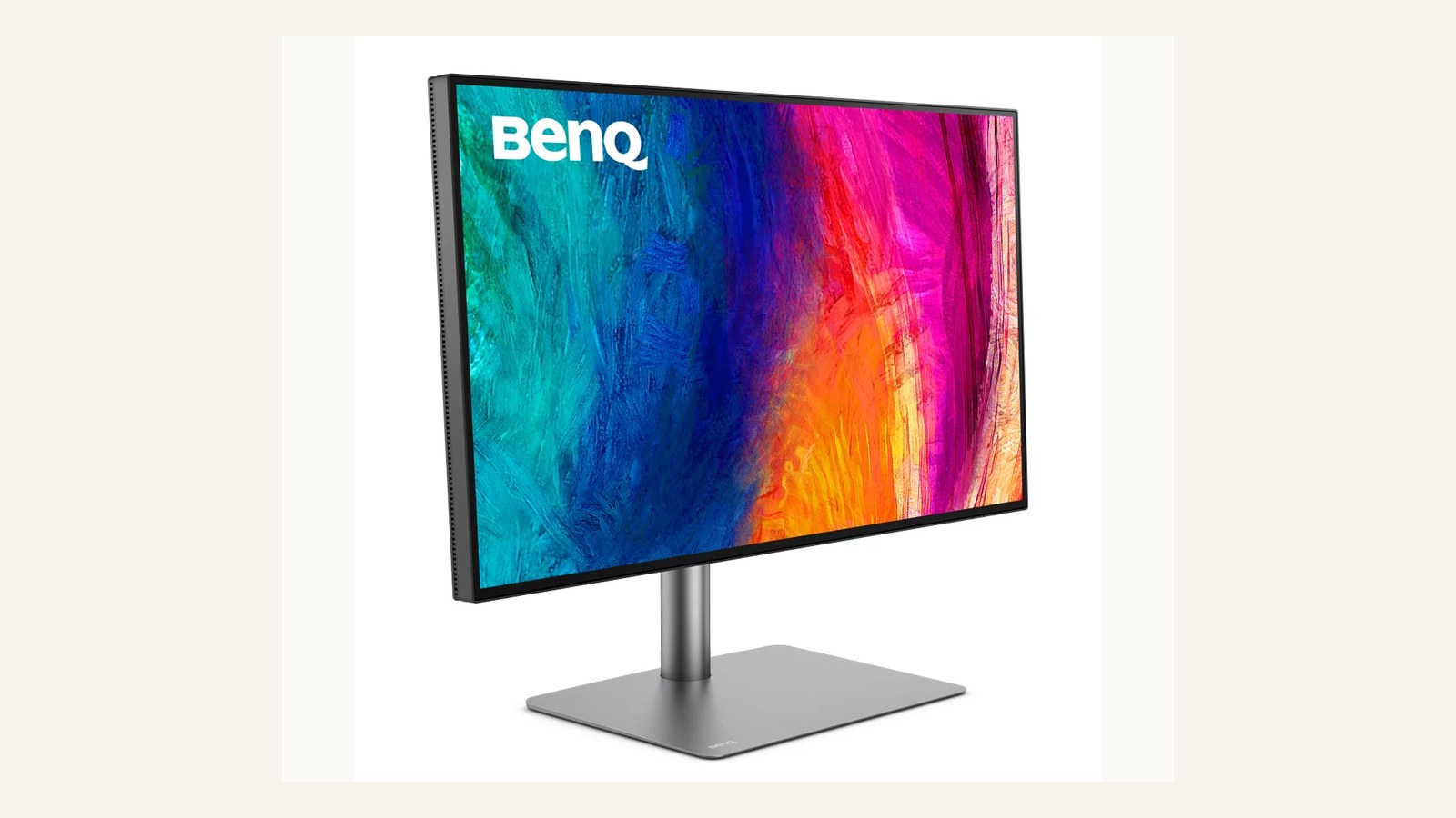
| BenQ PD3225U | Mac-heavy design studios and brand teams | 32-inch 4K studio workflow, IPS Black positioning, 98% P3, 100% sRGB and Rec.709 claims | Not as specialized as a dedicated high-end ColorEdge workflow |
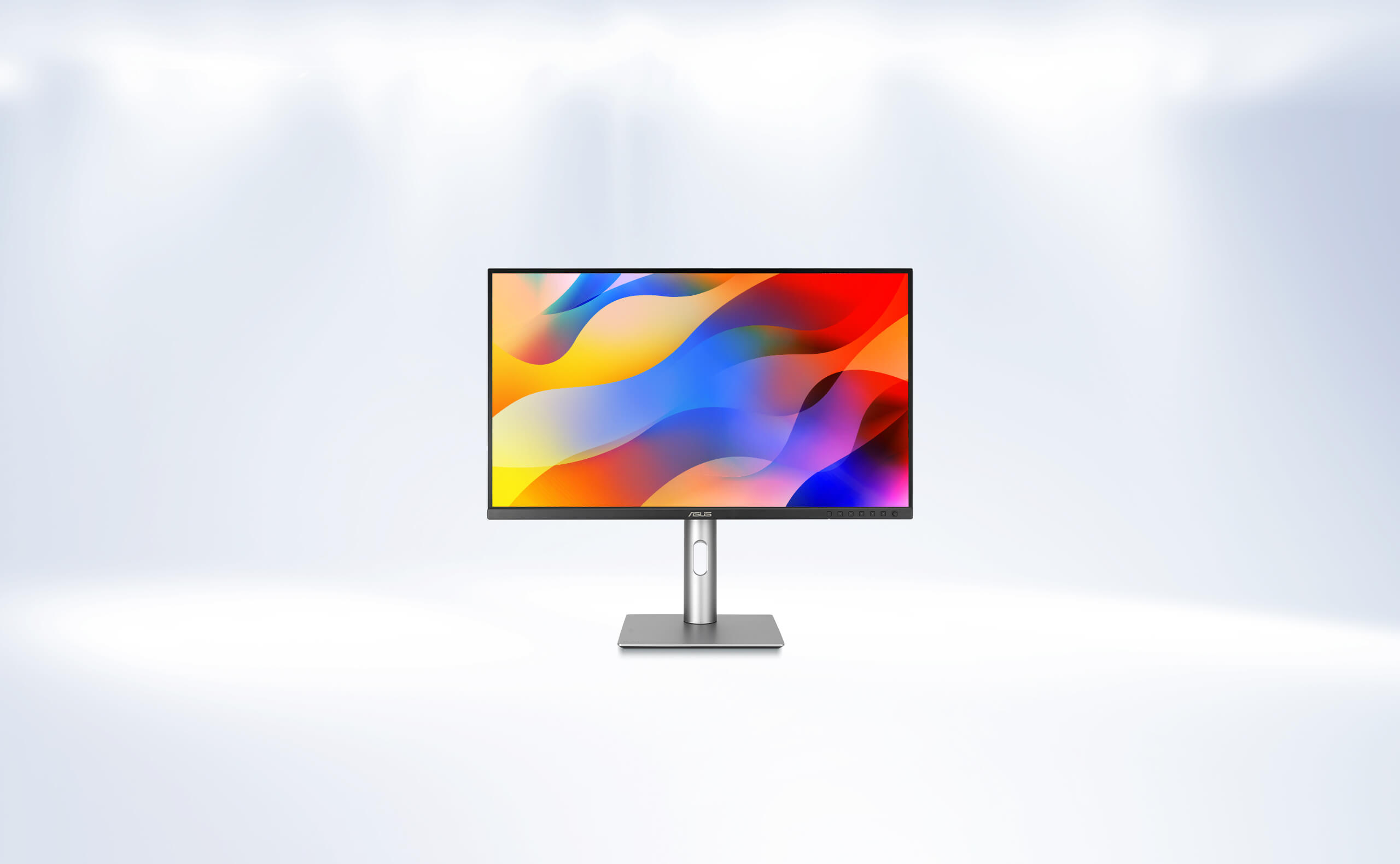
| ASUS ProArt PA279CRV | Value-conscious creators needing strong published specs | 27-inch 4K, 99% DCI-P3, 99% Adobe RGB, Calman Verified, USB-C power delivery | Spec value still needs local return and warranty checks |
| Dell UltraSharp U2723QE | Productivity-first designers who still want strong image quality | 27-inch 4K USB-C hub, IPS Black, 90 W power delivery, and broad desk usefulness | Not a dedicated color-critical reference display |
| Calibration workflow | Studios that need repeatable color confidence | Adds measurement discipline beyond factory claims | Requires process, not only hardware |
How We Judge Creative Monitors
Monitor buying should start with color risk. A brand designer creating social graphics needs consistency and comfortable workspace. A photographer preparing print work needs tighter calibration confidence. A motion or HDR colorist may need brightness and HDR support that a general UI designer does not. Official specifications such as DCI-P3, Adobe RGB, sRGB, Delta E, USB-C power delivery, and calibration tools are useful only after the workflow is named.
EIZO ColorEdge CG2700X: best for color-critical studios
EIZO describes the ColorEdge CG2700X as a 27-inch 4K UHD monitor with HDR targets, USB-C, LAN connectivity, and 90 W class power delivery. Its strongest fit is color-critical work where confidence matters more than saving money. A studio should consider it when missed color decisions create real cost, not when the team mostly needs a nicer office display.
BenQ PD3225U: best studio default for many Mac design desks
BenQ positions the PD3225U around Mac-friendly creative work, IPS Black contrast, 98% P3, 100% sRGB, 100% Rec.709, and Delta E claims. That mix makes it practical for studios that need color confidence, USB-C or Thunderbolt convenience, and a large canvas without stepping into the highest specialist tier.
ASUS ProArt PA279CRV: best value-oriented creator pick
ASUS describes the PA279CRV as a 27-inch 4K HDR ProArt display with 99% DCI-P3, 99% Adobe RGB, Calman verification, Delta E under 2 positioning, and 96 W USB-C power delivery. It is compelling when a designer wants strong creative specs for less than a specialist flagship.
Dell UltraSharp U2723QE: best for mixed design and office productivity
Dell U2723QE is a strong fit when a designer needs a reliable 4K USB-C hub monitor for UI, documentation, content work, and general studio productivity. It is not the most specialized color choice, but it can be the right desk decision when the monitor also anchors the office workflow.
Calibration workflow: buy the process as well as the display
A calibration-capable workflow matters when color decisions repeat. Even a strong monitor can drift or be used in poor lighting. Studios doing print, photography, or color-sensitive brand work should budget for calibration process and viewing conditions, not only panel specifications.
Buyer Scenarios
Use the shortlist against a real production scenario before buying. A solo designer, a three-person studio, an in-house creative operations team, and a client-side brand manager do not have the same risk. The safest decision names the current project, the person responsible for adoption, the budget owner, the license or support risk, and the exit path if the product stops fitting. If the team cannot name those five things, the product may still be interesting, but the buying decision is early.
For client work, document the source, account owner, license or renewal rule, and files that need to remain accessible after the project closes. That handoff discipline is especially important for fonts, stock assets, templates, hardware warranties, and systems that depend on paid seats. A tool that looks inexpensive at checkout can become expensive when the next designer cannot access the files, when a license does not cover the final deliverable, or when a reviewer approves the wrong version.
How to Choose Without Overbuying
Choose by risk. If wrong color costs money, buy for calibration confidence and support. If the work is mostly UI, brand, and web content, balance gamut, USB-C, ergonomics, and desk size. If the monitor will serve design and operations, prioritize hub features and comfort. Keep return windows and warranty terms in the decision.
The practical rule is simple: buy for the bottleneck you can name, not for a feature list you might use later. If the bottleneck is version confusion, fix review status. If the bottleneck is license uncertainty, fix rights documentation. If the bottleneck is color trust, fix the monitor and calibration process. If the bottleneck is production speed, use templates as a starting structure rather than a finished brand decision.
Internal Reading
For related decisions, read creative brands review, drawing tablet comparison, software deal guide, review methodology. The goal is to connect each purchase to the broader studio system rather than make isolated tool decisions.
Sources Checked
- BenQ PD3225U official page
- EIZO ColorEdge CG2700X official page
- ASUS ProArt PA279CRV official page
- Dell UltraSharp U2723QE official page
FAQ
Do all designers need a color-critical monitor?
No. UI, presentation, and everyday brand work mainly need a consistent screen, sensible brightness, and a workflow that does not surprise clients. A color-critical monitor becomes more important when print proofs, photography, packaging, motion color, or client sign-off depends on close color matching across devices and vendors.
Is factory calibration enough?
Factory calibration can be enough for general studio work if the monitor ships with a credible report and the team keeps room lighting stable. Print, photography, and color-critical teams should still build a calibration routine with a colorimeter, target settings, and periodic checks so drift does not become a hidden production risk.
What else should buyers check?
Check current pricing, warranty coverage, port fit, return terms, desk space, calibration support, and who owns the asset after purchase. For client-facing work, also confirm whether the studio needs a shared calibration policy so designers, retouchers, and production partners are not making color decisions from mismatched screens.
How does Design Overflow handle affiliate context?
Affiliate relationships do not decide rankings, product order, or verdicts. Commercial links are separated from the evidence trail, and source links stay visible so readers can verify claims directly. The editorial policy explains how Design Overflow handles review independence, disclosure, corrections, and the difference between useful buying context and paid promotion.
Studio Implementation Notes
For monitor buying, the room matters. A strong display used under inconsistent lighting, next to a window, or without a calibration habit can still produce unreliable decisions. Before upgrading every desk, identify which seats make color-critical calls and which seats mostly need comfortable UI or layout production. Put the best calibration process where the color risk is highest. Keep a record of calibration dates, monitor profiles, operating-system display settings, and connected devices. This helps the team understand whether a color dispute comes from the asset, the screen, the room, or the export workflow.
Final Studio Decision Check
A monitor decision should also include consistency across the studio. If one designer reviews brand color on a calibrated wide-gamut display and another reviews the same asset on an uncalibrated laptop in a bright room, the team will still argue about color. Decide which screen is the reference for final visual approval and document that choice. For smaller studios, this may mean one trusted review station rather than premium monitors on every desk. For remote teams, it may mean exporting reference images, using consistent profiles, and noting that client devices will vary. The monitor should reduce uncertainty, not create a false promise that every viewer will see identical color. Use the strongest display where the final decision is made.
Production Proof Before Purchase
A final pre-purchase check should include one real project artifact. For software, use a live component, proof, template, font, or asset instead of a theoretical example. For hardware, place the device in the actual desk setup and confirm cable reach, lighting, ergonomics, warranty, and support path. For marketplaces and licenses, record the exact source, permitted use, account owner, and handoff note. This practical check keeps the decision grounded in production rather than preference. It also gives the studio a reusable audit trail if the client asks why the product was chosen later.
Decision Record
One more safeguard is to write the decision in plain language before purchase: what problem is being solved, what evidence supports the choice, who maintains the tool or asset, what would make the team replace it, and which source should be checked when terms change. That note is small, but it prevents future readers from mistaking a dated preference for a current recommendation.